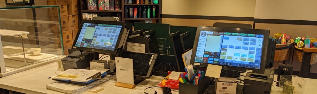
“When you’re starting as a new barista, (the legacy POS) is very, very overwhelming: the pressure to do things quickly, there’s so many buttons, and you have a customer saying, ‘that’s not what I ordered.’”
– starbucks BARISTAs
Even with experience, “you have to go on a journey. Customers comment on how fast I’m tapping, but I’m just having to tap so many things to get to what I need… It’s too complex.”
“This (new POS) is a fresh, clean slate where it’s more intuitive and natural… It’s something we really need in stores. As a barista trainer, I feel this will be so much easier to train others on. I’m really excited.”
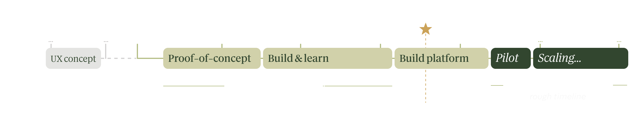
1. Project timeline & goals
A multi-year innovation initiative to completely reinvent the point-of-sale, replacing the legacy POS while making meaningful improvements to the barista experience and a measurable impact to the business.
Faster to use
Reduce customer wait time and line balk to increase sales.
More accurate
Reduce waste and customer complaints.
Satisfying
Improve barista jobs to help reduce turnover.
Easy to learn
Intuitive so new hires are effective, fast, with fewer interruptions to trainers. Reduce cognitive load so baristas can focus more on craft and customer connection.
Simpler systems
Integrated commerce platform to speed up development, unlock new capabilities, and enable flexible-use hardware that can adapt to the needs of the store.

2. My role:
UX player-coach, experience strategy
Two of us from UX were assigned at the start since we were comfortable with ambiguity, working with stakeholders, and self-organizing — essential skills for this project that ran more like a startup, outside the normal org structure.
While we collaborated closely, we gradually defined our own focus areas:
- The principle designer created “best guess” designs to quickly unblock engineering so the team could experiment and assess the tech feasibility
- I defined the foundations to make sure we were solving the right problems and set the future vision, while assessing barista desirability
As the UX team and workload grew – eventually reaching about 5 to 6 people, plus myself – I proactively took on more leadership to foster a culture of collaboration and experimentation, where everyone could feel empowered; mentor the UX team; partner with Product and others on strategy; and guide all the UX work to both define the vision and turn it into reality.
Lead
RESEARCH
- Define research strategy & roadmap
- Create broad, system-level artifacts to guide cross-team collaboration
- Run research to identify problems to solve and iterate on designs
- Mentor researchers
Lead
DESIGN
- Define UX architecture and vision for the system
- Create concepts, wireframes, and prototypes
- Review visual/UI designs & specs
- Help refine designs with engineers
- Mentor designers
Lead
STRATEGY
- Advocate for baristas to build empathy and drive change
- Influence the product backlog, roadmap, and requirements
- Systems-thinking to identify areas to collaborate with other teams
- Executive demos to build buy-in and excitement
3. Designed “by baristas, for baristas”
We involved baristas regularly at every step in our process to foster an experimental mindset, stay focused on barista needs, and rapidly test & learn.
We built trust with stakeholders by proving our value; maintaining consistent, clear communication and collaboration; and gathering the essential insights needed to make informed product decisions.
We partnered with over 15 cross-functional teams* to understand the holistic experience and requirements, innovate and iterate on designs**, and prioritize the most critical blockers to adoption.
* Stakeholders: Product, Engineering, Accessibility, Ops, Support, Training, Analytics, Hardware, Fraud, Security, Loyalty, and more.
** Designs spanned all use cases for a POS, including:
- Primary: order entry (e.g., select & customize items) and checkout (e.g., rewards, discounts, payment)
- Supplemental: manage orders (e.g., closed orders, refunds); manage store (e.g., item availability, personalization); employee management; device settings; and more
- Holistic experience: training and store communication; tech support process; analytics needs; ergonomics; and more.
1
Discovery & design
Understand context to make sure we’re solving the right problems; iteratively design a solution while validating that we’re on the right track.
~85 studies over 3 years
2
Test & learn in stores
Learn what’s working and what prevents adoption from baristas using the new POS in stores, encompassing training or awareness of features, usability, system performance or reliability, support process, missing functionality, and more.
~30 studies over 3 years
3
Benchmarking & metrics
Routinely measure the core KPI’s — speed, accuracy, satisfaction, and learnability – to track progress, and combine it with other feedback to help identify when baristas feel it’s ready to scale.
~5 studies over 3 years
4. Sample design: entering an order
Order entry and payment are the core experience; baristas need it to be right. Anything that slows them down or causes frustration — even if rare! — results in a very painful experience that prohibits adoption; their standards are high.
To accommodate the repeated and constant use, baristas need it to be:
- efficient and fast, to get through the line quickly;
- intuitive and reliable, so they can focus on the customer not the tech;
- consistent, to build muscle memory from repeated actions;
- accurate, so they spend less time fixing mistakes or errors;
- accessible, to adjust and accommodate barista or store needs; and
- proactive, to help them follow guidelines and answer questions.
To land on these designs, we:
1
Tested numerous different concepts
To better understand barista needs, quickly try things out in a scrappy way, and figure out the right design direction.
2
Co-designed with baristas
To validate our understanding of barista needs and refine designs to decide what to build and test.
3
Updated the design several times
Redesigned several times based both on feedback from baristas testing it in stores and as engineering could support additional functionality, until it ultimately met the barista needs.
Product menu
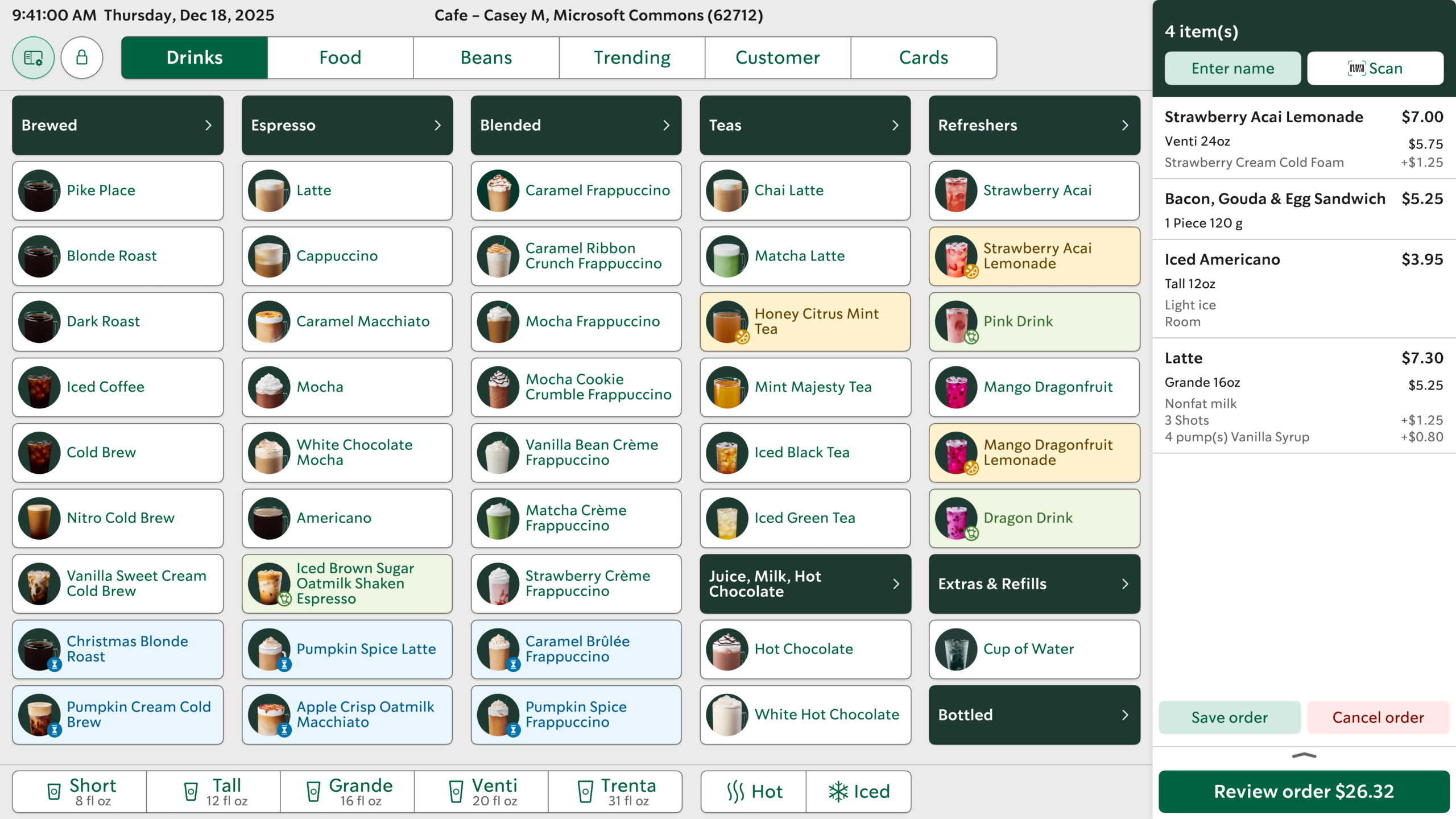
Starbucks offers a massive selection of core products and seasonal items, easily exceeding 200 at times.
The challenge was: how do we surface all products in a way that is very quick, accurate, and intuitive?

80% of all drink orders in a single tap
Most popular items show immediately and are the quickest to enter, with a consistent layout to aid in muscle memory
All items accessible within 2-3 taps
Anything can be entered quickly and in a manner to facilitate muscle memory; the updated categorization is also more intuitive
Content is easily skimmable
Images, color, icons, and concise names make it quick to identify and select the correct item
We also took advantage of the new commerce platform to further simplify the ordering experience at a store for specific situations, such as: showing a customer’s previous orders on the POS after they scan their app; and displaying drinks currently trending on social media so baristas can more easily learn them.
Product customization
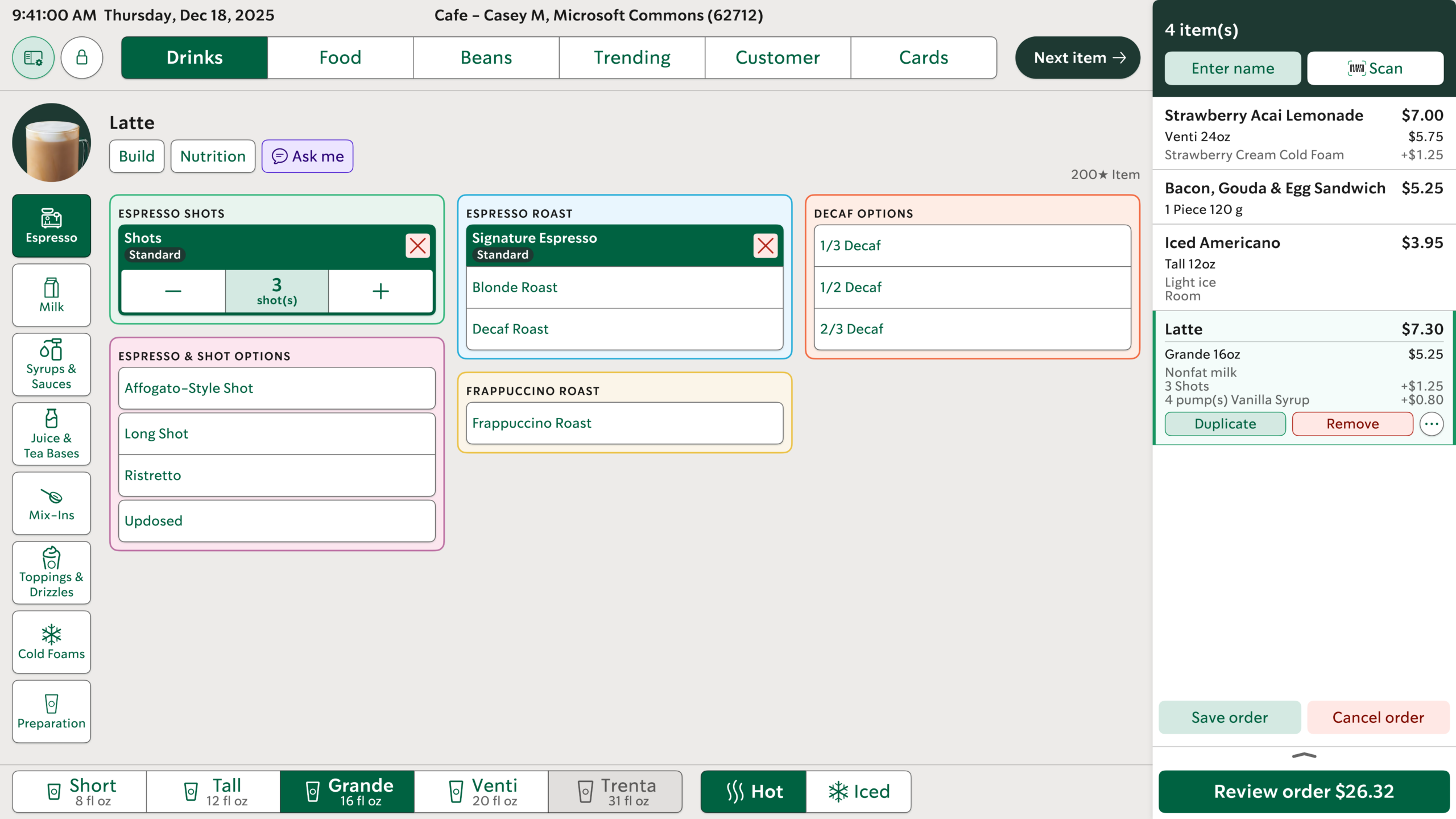
Customers can personalize items from a long list of options, which also changes seasonally – and any combination could go viral on social media next.
Baristas need a way to easily enter any customization, even if it’s not currently typical or popular, as long as it doesn’t go against Ops or safety guidelines.
The challenge was: how to surface all modifier options in a way that is very quick, accurate, and intuitive?
Most common always a tap away
Very quick and easy to access at anytime, located at the bottom of the screen; for drinks, that’s size and temperature
All modifiers accessible within 2 taps
Anything the customer wants can be entered efficiently, with minimal scrolling to facilitate muscle memory; the updated categorization IA is also more intuitive to use
Consistent options to build muscle memory
All options always show in a consistent location so the barista can move fast
Reduce stress on memory
Proactively surface the standard recipe, nutritional information, and more to help the barista learn and answer customer questions
6. Key results overview
While the new POS has definite improvements in speed and accuracy over the legacy system, the most significant gains are to learnability and satisfaction.
“If you think about how many people we hire who use the app… they’ll know how to use this within minutes. It will give them more confidence, allow them to use it faster.”
– starbucks baristas
“It’s a lot more visual, it includes a lot more information than the old POS. I feel like it gives baristas more insight in how to answer questions. When you’re new, you don’t know everything.”
“I loved this… I’d have it memorized by the end of the week.”
~ 1 week
Time to proficiency
Our goal was to transform one of the hardest jobs to learn for new baristas into one of the easiest.
The legacy POS is notoriously difficult to pick up, requiring rote memorization and 1 to 3 months to feel proficient; some baristas quit before ever feeling comfortable.
Conversely, baristas hired while we were testing in stores felt the new POS was remarkably easy to learn and that it also helped them onboard as a barista in general (learn products, interact with customers, etc).
~ 1 hour
Time to re-gain performance
After only an hour of use, experienced baristas were already trending faster and more accurate than on the legacy system, despite not yet feeling proficient.
This strongly indicates that the overall impact to stores may be minimal during rollout due to its intuitiveness, despite baristas needing to rebuild muscle memory.
What’s next?
At the time of writing, the core flow and functionality has been designed and developed; the test was a success, the project was fully funded and approved, executives are excited about what it will unlock for the business, and, after it was demoed at an internal conference, store managers are also excited.
Most of the remaining work is on features to support store operations and market-specific regulations, while engineering finishes building the rest of the commerce platform to improve system performance and reliability.
Then it can be piloted in a single store for a final test before rapidly scaling it to all company-owned stores in North America.
7. Constraints and limitations
Every project has challenges, and here were some of the ones we faced.
Startup mode: tenuous funding and low staffing
This was an experiment geared towards assessing feasibility, viability, and desirability, then advocating for it at regular intervals to get the funding to continue. It was also a tumultuous time, with the C-suite changing three times over the project, so the team needed to regularly sell it to new executives to secure that funding.
Since we all passionately believed it had merit, this caused extra pressure to prove its value, work fast and scrappy, and collaborate closely to make it as good as possible.
But due to the clear differentiator of the user experience, paired with the technology improvements, we managed to maintain leadership support despite all the changes and eventually get approval to build it so that it can be scaled to all stores.
Organizational silos limit innovation
Our rapid innovation was only possible due to being positioned outside of the traditional Starbucks org structure. This enabled us to stay focused, work more agilely within a cross-functional team, take ownership of the experience, and quickly make informed decisions.
However, being separate also limited the scope of innovation due to a lack of alignment on priorities with other teams and systems. Such as, we identified opportunities to significantly enhance the overall experience to better align to barista workflows, especially in drive thru, but we could only advocate for those improvements — with mixed success.
Additionally, the existing tech infrastructure had a lot of technical debt and non-integrated systems. While this project aimed to also address some of these issues by building a new commerce platform, progress was sometimes slower than anticipated, especially if it depended on coordination with teams whose roadmaps did not prioritize this work.

8. Reflections
A fulfilling challenge
Cross-functional, collaborative teams who share a common vision and are empowered to experiment, challenge the status quo, and make decisions in pursuit of that goal enables rapid innovation and a solution that better meets the needs of people – in this case baristas and, by extension, customers.
I didn’t intend to lead all the UX work and the team, but fell into it by consistently expanding my role as I noticed opportunities to enhance the experience for baristas, customers, or the team. And I embraced collaboration, diplomacy, and advocacy to build trusted partnerships with stakeholders to be able to do so.
It was incredibly rewarding to help simplify and improve the lives for baristas, who already need to juggle so much, and to do so alongside a talented, motivated team that shared my deep passion to make things better.
This was easily my favorite project from my 12 years at Starbucks. The scope and complexity was massive and I’m incredibly proud of what we accomplished.